Context & Challenge
The bank wanted to attract new customers by introducing a digital wallet within its mobile app. The vision was simple:Allow people to start transacting instantly without needing a full bank account.
The challenge?
The existing onboarding was slow, paperwork-heavy, and had high drop-offs.
The entry point for this new wallet inside the app wasn’t clear.
I had to design under tight timelines and limited research budget, relying heavily on the Business Requirements Document (BRD) and stakeholder input.
Problem Statement:
New-to-bank customers were abandoning onboarding because the process was long and complex. This slowed customer acquisition and limited revenue growth.
"A problem well defined, is a problem half solved."
Albert Eistein
Approach
I used a user-centered design approach, layered with design thinking, while staying practical to the project realities.
Understanding the Brief
-
Started with the BRD as a benchmark.
-
Noticed gaps in user needs and clarity.
.png)
Quick Research & Alignment
-
Held conversations with product managers, compliance, and operations teams.
-
Mapped out what success meant for both the bank (faster acquisition) and the user (instant access to money tools)
Early Exploration
Sketched draft wireframes to visualize flows.
Focused first on where the digital wallet should live in the app (entry point). This was a critical design decision because visibility = adoption.

I initially explored placing the digital wallet under the full account listing flow. However, this buried the option too deep, introduced decision fatigue, and diluted focus from the wallet — making it harder to achieve the business goal of faster adoption by new-to-bank customers.


Feedback Loops
Walked stakeholders through drafts.
Iterated based on their feedback.
Ran a peer design review to sharpen usability.
Final Alignment
Presented polished designs to stakeholders.
While I couldn’t run formal usability testing (time/budget constraints), I did informal validation through quick user checks and domain research.
Key Design Decisions
Entry Point
Explored different onboarding prompt placements after the user clicks “Register”. Tested three variations:

Option 1
Option 2

1
All accounts listed: digital wallet placed as one of many options.

Wallet-only option: immediate onboarding into the wallet.
2
Option 3

Grouped actions: existing onboarding options with digital wallet added as a new choice
3
While option 2 offered the fastest wallet adoption path, option 3 was ultimately chosen as it aligned with stakeholder preference and kept the wallet visible without overwhelming users.
Onboarding Flow: Balancing Simplicity with Compliance
One of the biggest design challenges in this project was the bank’s compliance requirements. The business mandated that onboarding for the digital wallet must include:
-
Capturing photos of the front and back of the customer’s ID
-
Taking a selfie for liveness check
-
Capturing the customer’s handwritten signature
From a regulatory and risk perspective, these steps make sense. They protect the bank against fraud, satisfy KYC/AML requirements, and build trust with regulators and serious customers.
But from a UX perspective, they introduced friction. Each additional step risked frustrating new users and increasing onboarding drop-offs — the very opposite of what the digital wallet was meant to solve.
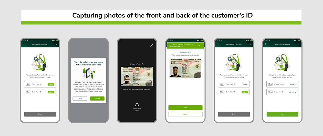

Instead of simply accepting this as a trade-off:
I explored alternatives: proposed a tiered KYC approach (basic wallet with low limits first, full KYC later). This model has been successful in mobile money ecosystems like M-Pesa.
While tiered KYC wasn’t feasible for the first release due to internal policies, the design I delivered made the mandatory steps feel less heavy and more trustworthy.
I advocated for UX-friendly solutions:
-
Real-time capture guidance (auto-detect ID edges, selfie tips)
-
Friendly copy that explains why these steps matter
Reflection:
This part of the project showed the real-world tension between user-centered design and regulatory constraints. I couldn’t eliminate the friction entirely, but I made sure the experience was as smooth and transparent as possible.
For me, good UX in financial products isn’t just about reducing steps — it’s about balancing trust, compliance, and usability.
Impact
Even before full rollout, this solution showed business value:
Reduced onboarding friction - projected higher sign-up completion rates.
Faster customer acquisition - customers could transact immediately without waiting for account approval.
Set the stage for upselling bank accounts later (wallet as a bridge product).
Business Impact Statement:
This design helped the bank turn onboarding from a blocker into an acquisition driver, while giving customers a fast, simple way to start banking.
Reflections
Looking back:
I would have loved to run in-depth usability tests, but worked with what was realistic.
This project reinforced my belief that great UX is about balancing user needs, business goals, and constraints.
Case Study Takeaway
I didn’t just design screens.