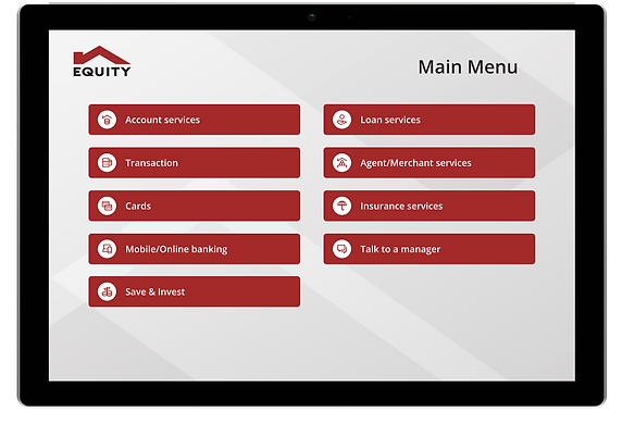
Meet the redesigned ticket dispenser UI

Predictable interactions.
Real-world conventions.

How it all started...
A line of customers waiting at the ticket dispenser made Equity Bank wonder why there was a delay. After checking it out, the customer experience team found that the kiosk's design needed an update. They’ve even ideated on giving it a new look to improve the overall experience.
Requirements Gathering & Discovery
Recognizing the absence of user research as our initial compass, my team and I orchestrated enlightening clarification sessions. These engaging meetings brought together minds from various teams – project managers, product owners, business analysts, and the customer experience teams. Together, we embarked on a quest to uncover needs, distill requirements, and explore various innovative solutions.
So what is it with the old UI?
Venturing into the journey of discovery, we immersed ourselves in collaborations with diverse business teams. Adding a personal touch, I devoted my free time to engaging with select bank customers through user research. The outcome? A treasure trove of insights that unveiled various factors responsible for the friction plaguing the user interface.
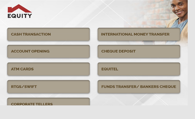
The old QMS
Unclear navigation
Use of banking jargon unfamiliar to most users
Inadequate user control mechanisms
Lack of information hierarchy
Information architecture
To accelerate the user's journey and enhance interface comprehension, we sought a solution for arranging essential information, such as the bank's services. Through collaboration with the business team, we crafted a refined sitemap. We brainstormed, posed pertinent queries, iteratively polished the concept, and charted the navigation flow. The result? A structured information architecture that now steers us confidently through the design process.

Sitemap/information architecture
Wireframing

I designed wireframes in varying fidelity levels, undergoing numerous iterations. Our aim was to empower users with swift, intuitive navigation. To conquer UI challenges – minimalism, precise navigation, icons, and relevant labels – these high-fidelity Figma wireframes emerged


A/B Testing
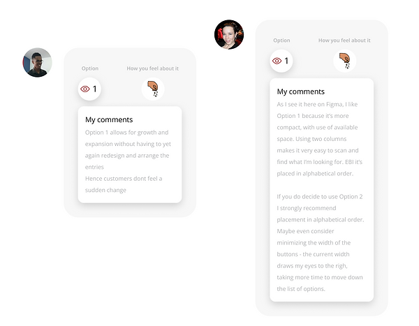
Let's spice things up with fresh perspectives! We engaged UX Designers from various teams in an A/B testing session using Figjam, where designers cast their votes on design options. Check out some of the feedback from our fellow designers below.



Prototyping & Usability testing
Some of the mockups I crafted. We test-launched the new QMS in select Nairobi branches, and the feedback has been overwhelmingly positive. Stay tuned for the nationwide roll-out across all branches!